
Mobile devices have become the primary way people browse the internet. Millions of users rely on smartphones and tablets to search for information, shop online, and access digital services every day. Because of this shift, search engines now place significant importance on mobile-friendly websites when determining search rankings. A well-planned Mobile SEO Guide helps website owners create faster, more responsive, and user-friendly websites that perform well across all mobile devices.
Mobile SEO focuses on optimizing your website specifically for users who visit through smartphones and tablets. It includes improving loading speed, responsive design, navigation, image optimization, structured content, and overall usability. These improvements not only create a better experience for visitors but also help search engines crawl and rank your pages more effectively.
Whether you manage a personal blog, a business website, or an online store, mobile optimization has become an essential part of every successful SEO strategy. This guide explains the key principles of Mobile SEO and the practical steps you can take to improve your website’s mobile performance.
What Is Mobile SEO?
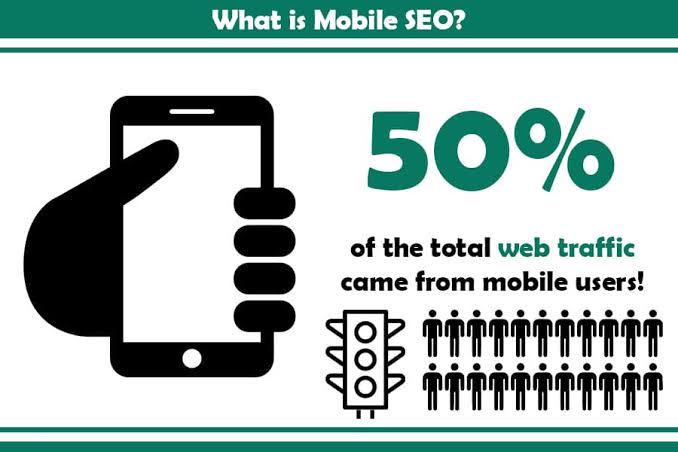
Mobile SEO is the process of optimizing a website so it performs efficiently on mobile devices. The goal is to ensure visitors can easily access content, navigate pages, and interact with your website regardless of screen size.
Unlike desktop optimization, mobile SEO focuses on smaller displays, touch navigation, faster loading times, and responsive layouts. Since search engines primarily evaluate the mobile version of a website, maintaining a mobile-friendly experience is critical for long-term SEO success.
A properly optimized mobile website loads quickly, displays content clearly, and provides a seamless browsing experience.
Why Mobile SEO Is Important

Search engines prioritize websites that deliver an excellent mobile experience. If your website performs poorly on smartphones, it may struggle to achieve strong search visibility.
Some major benefits of mobile SEO include:
- Improved search rankings
- Better user experience
- Faster page loading
- Increased organic traffic
- Higher engagement
- Lower bounce rates
- Better conversion opportunities
Optimizing for mobile users ensures your website remains competitive in today’s search landscape.
Responsive Web Design

Responsive design allows your website to automatically adjust its layout based on the visitor’s screen size.
Instead of creating separate desktop and mobile websites, responsive design uses flexible layouts that adapt to different devices.
Benefits include:
- Consistent user experience
- Easier website management
- Better SEO performance
- Improved accessibility
- Simplified maintenance
A responsive website provides a smooth browsing experience on smartphones, tablets, laptops, and desktop computers.
Improve Mobile Website Speed

Website speed is one of the most important ranking factors for mobile SEO. Visitors expect pages to load within seconds, and slow websites often experience higher bounce rates.
You can improve mobile speed by:
- Compressing images
- Enabling browser caching
- Reducing unnecessary plugins
- Minifying CSS and JavaScript
- Using page caching
- Choosing reliable hosting
- Using a Content Delivery Network (CDN)
Fast-loading pages encourage users to stay longer and interact with your content.
Optimize Images for Mobile Devices
Large images increase loading times, especially on slower mobile networks.
To optimize images:
- Compress image files before uploading.
- Use appropriate image dimensions.
- Add descriptive file names.
- Include meaningful alt text.
- Avoid uploading unnecessarily large images.
Optimized images improve both performance and accessibility.
Mobile-Friendly Navigation
Navigation should remain simple and intuitive on small screens.
Best practices include:
- Clear menu structure
- Easy-to-tap buttons
- Readable font sizes
- Proper spacing between links
- Logical content organization
Good navigation helps visitors find information quickly without frustration.
Mobile-Friendly Content

Content should be easy to read without zooming.
Recommendations include:
- Short paragraphs
- Clear headings
- Bullet points
- Readable font sizes
- Adequate spacing
- High contrast between text and background
Well-structured content improves readability and encourages users to stay on your website.
Optimize URLs
Simple, descriptive URLs are easier for both users and search engines to understand.
Good example:
example.com/mobile-seo-guide
Poor example:
example.com/page?id=7845
Short URLs improve readability and help communicate the topic of the page.
Internal Linking
Internal links connect related pages within your website.
Benefits include:
- Better crawlability
- Improved navigation
- Higher engagement
- Distribution of page authority
Use natural and descriptive anchor text to strengthen your website structure.
Mobile User Experience
A positive mobile experience goes beyond speed.
Your website should provide:
- Fast interactions
- Stable page layouts
- Touch-friendly elements
- Clear call-to-action buttons
- Easy scrolling
Improving usability increases visitor satisfaction and supports better SEO performance
Mobile-First Indexing
Mobile-first indexing means search engines primarily evaluate the mobile version of your website when determining rankings. If your mobile site is incomplete, slow, or difficult to use, it can negatively affect your search visibility.
To prepare your website for mobile-first indexing:
- Ensure the mobile version contains the same valuable content as the desktop version.
- Keep page titles and meta descriptions consistent across devices.
- Make all important images, videos, and internal links accessible on mobile.
- Test your website regularly on different screen sizes.
A fully optimized mobile website helps search engines understand and index your content more effectively.
Core Web Vitals and Mobile SEO
Core Web Vitals are performance metrics that measure how users experience your website. These signals help identify whether a page is fast, responsive, and visually stable.
Largest Contentful Paint (LCP)
LCP measures how quickly the main content becomes visible. Faster loading improves the overall user experience.
Interaction to Next Paint (INP)
INP measures how quickly your website responds when users interact with buttons, links, or forms. A responsive website encourages visitors to continue browsing.
Cumulative Layout Shift (CLS)
CLS measures unexpected movement of page elements during loading. Stable layouts prevent accidental clicks and make navigation easier.
Improving these metrics supports both usability and search performance.
Common Mobile SEO Mistakes
Even well-designed websites can lose rankings if common mobile optimization mistakes are ignored.
Slow Loading Pages
Large media files, excessive scripts, and unoptimized resources increase loading times and may cause visitors to leave before the page finishes loading.
Poor Responsive Design
A website that does not adjust correctly to different screen sizes creates a frustrating browsing experience.
Small Text and Buttons
Tiny fonts or closely placed buttons make navigation difficult on touchscreens. Ensure text is readable and interactive elements are easy to tap.
Intrusive Pop-ups
Large pop-ups that cover the content can interrupt the browsing experience. Use them carefully and avoid blocking essential information.
Unoptimized Images
Uploading oversized images slows mobile performance. Always compress images and use appropriate dimensions.
Best Practices for Mobile SEO
Following these recommendations will help maintain a high-performing mobile website.
- Use a responsive website design.
- Improve page loading speed.
- Compress and optimize images.
- Enable browser caching.
- Keep navigation simple.
- Write easy-to-read content.
- Optimize internal linking.
- Test pages on different mobile devices.
- Update your website regularly.
- Monitor performance using SEO tools.
Consistent maintenance ensures your website continues to perform well as technologies and user expectations evolve.
Mobile SEO Checklist
Use this checklist to review your mobile optimization efforts.
- Responsive design enabled
- HTTPS security active
- Fast page loading
- Optimized images
- Readable font sizes
- Touch-friendly buttons
- Mobile-friendly navigation
- Optimized URLs
- Internal links working correctly
- No broken pages
- Structured data implemented where appropriate
- Regular performance monitoring
Completing these checks helps create a reliable and user-friendly mobile experience.
How to Measure Mobile SEO Success
Monitoring your website helps you identify improvements and discover areas that need attention.
Important metrics include:
- Organic mobile traffic
- Mobile bounce rate
- Average session duration
- Click-through rate (CTR)
- Average search position
- Core Web Vitals performance
- Mobile conversion rate
Review these metrics regularly to evaluate the effectiveness of your optimization efforts.
Frequently Asked Questions (FAQs)
What is Mobile SEO?
Mobile SEO is the process of optimizing a website to provide a fast, responsive, and user-friendly experience for visitors using smartphones and tablets.
Why is Mobile SEO important?
It improves user experience, supports better search rankings, increases organic traffic, and helps websites perform well on mobile devices.
Does mobile page speed affect SEO?
Yes. Faster loading pages improve user satisfaction and contribute to stronger search performance.
What is responsive web design?
Responsive web design automatically adjusts the layout and content of a website to fit different screen sizes and devices.
How often should I review my Mobile SEO?
Review your website regularly, especially after design updates, content changes, or major platform upgrades, to ensure it continues to perform well.
Conclusion
A well-planned Mobile SEO Guide provides the foundation for delivering an excellent experience to today’s mobile users. By improving loading speed, using responsive design, optimizing images, simplifying navigation, and maintaining strong technical performance, you make it easier for both visitors and search engines to interact with your website.
Mobile optimization is an ongoing process rather than a one-time task. Regular testing, performance monitoring, and continuous improvements help keep your website competitive as search engines and user expectations evolve. When combined with high-quality content and sound SEO practices, a strong mobile strategy can increase visibility, improve engagement, and support sustainable organic growth over the long term.