
Creating a well-structured website requires more than attractive colors, images, and typography. The layout must also be properly organized so that content appears in the right position across different screen sizes. This is where CSS Flexbox becomes extremely useful for modern web developers.
A CSS Flexbox Generator is an online development tool that helps users create flexible layouts without manually writing every CSS property. Instead of repeatedly testing different values in a code editor, developers can adjust alignment, direction, spacing, wrapping, and other Flexbox settings through a visual interface.
Whether you are building a navigation menu, responsive card section, website header, or complete content layout, a Flexbox generator can make the development process easier and faster.
Beginners can use it to understand how Flexbox works, while experienced developers can use it to experiment with layout configurations and generate CSS code for their projects.
In this guide, you will learn what a CSS Flexbox Generator is, how it works, which properties matter most, how to create responsive layouts, and how to use generated CSS in real website projects.
1. What Is a CSS Flexbox Generator?
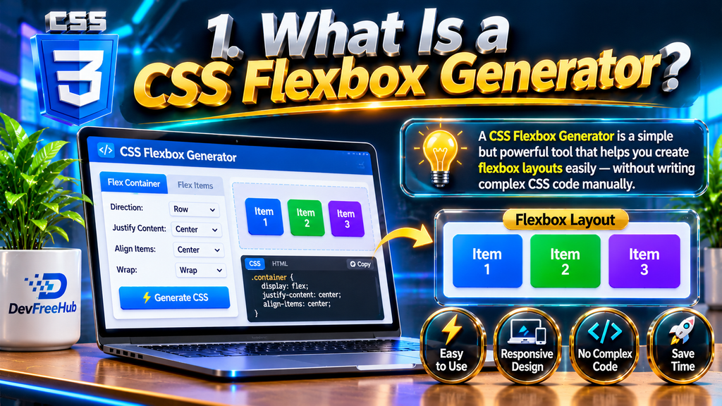
A CSS Flexbox Generator is a browser-based tool that allows developers to visually configure CSS Flexible Box Layout properties and generate the corresponding CSS code.
Flexbox is a CSS layout model designed to arrange elements inside a container along a single primary axis. It makes it easier to distribute available space, control alignment, and organize elements without relying on complicated positioning techniques.
For example, imagine creating a website header with a logo on the left and navigation links on the right. Traditionally, developers might use different layout techniques to position these elements. With Flexbox, the same structure can be created using a few simple CSS properties.
A Flexbox generator simplifies this process by allowing you to:
- Select the flex direction.
- Change horizontal and vertical alignment.
- Adjust space between elements.
- Control wrapping behavior.
- Set individual item alignment.
- Experiment with different layout configurations.
- Generate CSS code automatically.
The main purpose of this tool is to reduce repetitive coding and provide a visual way to understand how Flexbox properties affect a layout.
Example:
.container {
display: flex;
justify-content: space-between;
align-items: center;
gap: 20px;
}
This simple CSS configuration creates a flexible container where child elements are distributed across the available horizontal space and vertically aligned in the center.
A generator can help you create similar configurations without memorizing every property.
2. Why Should You Use a CSS Flexbox Generator?

Writing CSS manually is an important development skill, but testing multiple layout combinations can take time. A visual CSS Flexbox Generator helps reduce this effort by showing changes as you adjust properties.
Here are some important reasons developers use these tools.
Faster CSS Development
A generator lets you experiment with different layout settings without repeatedly writing and editing CSS rules.
You can change alignment, direction, and spacing through controls and immediately understand how the layout behaves.
This is especially helpful when developing complex component structures.
Better Understanding for Beginners
CSS Flexbox can initially feel confusing because properties such as justify-content, align-items, and align-content perform different functions.
A visual generator makes these differences easier to understand.
Instead of only reading documentation, beginners can change values and observe the results.
Reduced Coding Errors
When manually writing CSS, small mistakes can cause unexpected layouts.
A generator can produce properly structured CSS declarations for the selected settings. However, developers should still review the generated code before using it in production.
Improved Productivity
Frontend developers often work with repeated layout patterns, including:
- Navigation bars
- Product cards
- Feature sections
- Image galleries
- Footer layouts
- Dashboard components
- Content alignment sections
A Flexbox generator can speed up the initial layout process for these components.
Better Responsive Design
Flexbox supports flexible item sizing and wrapping, making it useful for layouts that need to adapt to different screen widths.
A generator can help developers experiment with these behaviors before implementing media queries or additional responsive adjustments.
3. How Does a CSS Flexbox Generator Work?
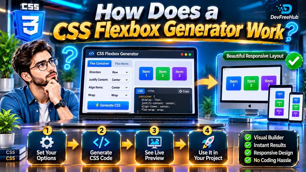
A CSS Flexbox Generator generally works by combining a visual preview with configurable CSS properties.
The user changes a property, and the preview updates to reflect the selected configuration. The tool then displays the corresponding CSS code.
Although different generators have different interfaces, their basic workflow is similar.
Step 1: Create a Flex Container
The first step is to activate Flexbox on the parent element.
The main CSS declaration is:
.container {
display: flex;
}
This changes the container into a flex container, allowing its direct children to become flex items.
Step 2: Select Flex Direction
Choose how the child elements should be arranged.
Common options include:
- row
- row-reverse
- column
- column-reverse
For example:
.container {
display: flex;
flex-direction: column;
}
This places the child elements vertically instead of horizontally.
Step 3: Configure Alignment
Next, adjust the positioning of elements using properties such as justify-content and align-items.
These properties control how items are distributed and aligned along the main and cross axes.
Step 4: Adjust Spacing
Use the gap property to create consistent spacing between flex items.
.container {
display: flex;
gap: 24px;
}
This creates a 24-pixel gap between adjacent flex items.
Step 5: Enable Wrapping
If the available space becomes insufficient, items may need to move onto another line.
The following property controls this behavior:
.container {
display: flex;
flex-wrap: wrap;
}
Step 6: Generate and Copy CSS
After configuring the layout, copy the generated CSS and place it inside your stylesheet.
Always review the code to ensure that it matches your project’s requirements.
4. Important CSS Flexbox Properties You Should Know
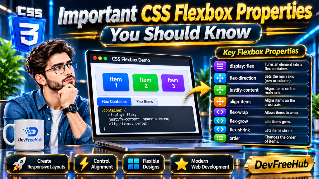
Understanding the main Flexbox properties helps developers get better results from a CSS Flexbox Generator.
Some properties apply to the parent container, while others control individual child elements.
Container Properties
1. display
The display property activates Flexbox.
.container {
display: flex;
}
2. flex-direction
Controls the direction in which flex items are arranged.
.container {
flex-direction: row;
}
Available values include row, row-reverse, column, and column-reverse.
3. justify-content
Controls the distribution of items along the main axis.
.container {
justify-content: center;
}
Common values include:
- flex-start
- flex-end
- center
- space-between
- space-around
- space-evenly
4. align-items
Controls the alignment of flex items along the cross axis.
.container {
align-items: center;
}
5. flex-wrap
Determines whether flex items stay on one line or move onto additional lines.
.container {
flex-wrap: wrap;
}
6. gap
Defines spacing between flex items.
.container {
gap: 15px;
}
7. align-content
Controls the distribution of multiple flex lines along the cross axis when there is extra space.
It is particularly relevant when wrapping creates multiple rows or columns.
Individual Item Properties
Flexbox also provides properties for controlling individual child elements.
flex-grow: Determines how much an item can grow relative to other items.
flex-shrink: Determines how much an item can shrink when space is limited.
flex-basis: Defines an item’s initial main size before remaining space is distributed.
align-self: Allows one item to override the container’s align-items setting.
order: Changes the visual order of flex items without changing their original HTML order.
These properties provide greater control over individual elements inside a flexible layout.
5. How to Create Responsive Layouts Using a Flexbox Generator

Responsive design is an important part of modern website development. A website should provide a comfortable browsing experience on desktops, tablets, and smartphones.
A CSS Flexbox Generator helps developers test different configurations and understand how elements behave when available space changes.
Follow these practical steps.
Create a Basic HTML Structure
Start with a parent container and three child elements.
<div class=”flex-container”>
<div class=”box”>Item One</div>
<div class=”box”>Item Two</div>
<div class=”box”>Item Three</div>
</div>
Add Flexbox CSS
Now apply Flexbox to the parent container.
.flex-container {
display: flex;
justify-content: space-between;
align-items: center;
gap: 20px;
flex-wrap: wrap;
}
.box {
flex: 1 1 200px;
padding: 25px;
background: #e8f0ff;
text-align: center;
}
The flex shorthand combines three individual properties: flex-grow, flex-shrink, and flex-basis.
In this example, each item has a preferred starting size of 200 pixels and can grow or shrink according to the available space.
Add Mobile-Friendly Adjustments
For smaller screens, you can change the layout using a media query.
@media (max-width: 600px) {
.flex-container {
flex-direction: column;
align-items: stretch;
}
}
This example changes the container direction to a vertical layout when the viewport width reaches 600 pixels or less.
Test Different Screen Sizes
After generating the CSS, test the layout at different viewport widths.
Pay attention to:
- Text overflow
- Unexpected horizontal scrolling
- Uneven spacing
- Elements becoming too narrow
- Buttons losing their usability
- Images exceeding their containers
A visual generator is useful for experimentation, but actual browser testing is necessary before publishing a website.
6. Practical Examples of CSS Flexbox Generator Use Cases
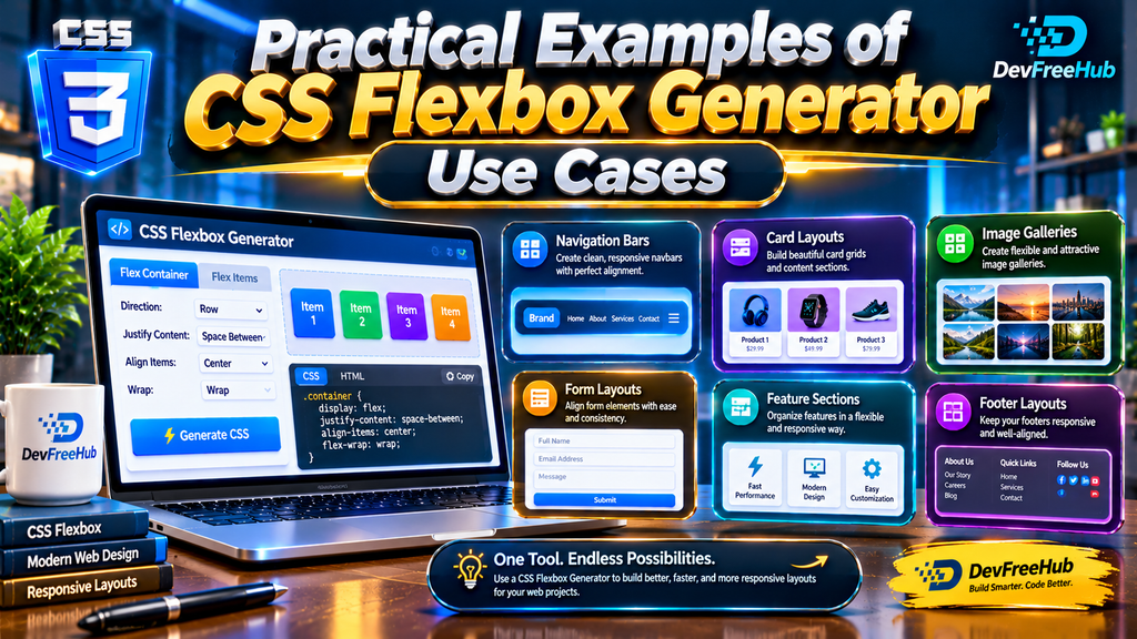
A CSS Flexbox Generator is useful for many everyday frontend development tasks.
Here are several examples where Flexbox can simplify layout creation.
Website Navigation Menu
Navigation menus frequently require horizontal alignment.
.navbar {
display: flex;
justify-content: space-between;
align-items: center;
gap: 20px;
}
This configuration places navigation elements inside a flexible container and aligns them vertically.
Responsive Card Layout
Product cards, service boxes, and blog cards can be organized using Flexbox.
.cards {
display: flex;
flex-wrap: wrap;
gap: 20px;
}
.card {
flex: 1 1 250px;
}
The cards can wrap onto additional lines when there is insufficient horizontal space.
Centering Content
One of the most popular uses of Flexbox is centering an element horizontally and vertically.
.center-box {
display: flex;
justify-content: center;
align-items: center;
min-height: 300px;
}
This approach is useful for login forms, loading screens, empty states, and promotional content.
Website Footer Layout
Footers often contain multiple sections that need consistent spacing.
.footer {
display: flex;
justify-content: space-between;
flex-wrap: wrap;
gap: 30px;
}
This makes it easier to organize footer content while allowing sections to wrap on smaller screens.
Dashboard Components
Admin dashboards frequently contain sidebars, navigation elements, and content areas.
Flexbox can help organize these sections without relying on unnecessary absolute positioning.
However, for complex two-dimensional layouts involving multiple rows and columns, CSS Grid may be a better choice.
7. Best Practices and Common Flexbox Mistakes to Avoid
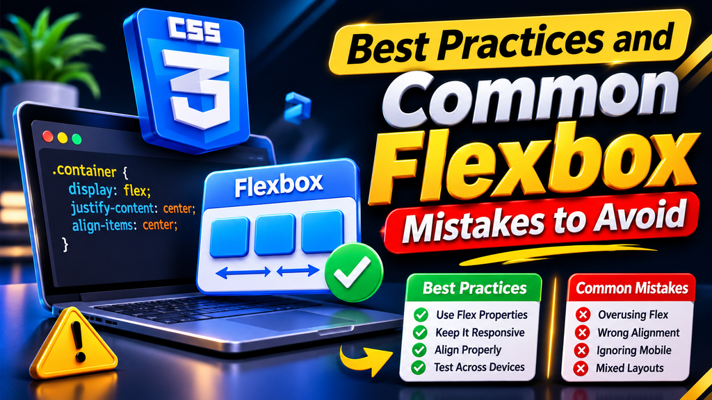
Using a CSS Flexbox Generator can simplify development, but understanding good CSS practices is still important.
Follow these recommendations to create maintainable and reliable layouts.
Use Flexbox for the Right Purpose
Flexbox is designed primarily for one-dimensional layouts.
It works especially well for arranging elements in a row or column.
For complex two-dimensional structures, consider CSS Grid instead.
Understand the Main and Cross Axes
One common mistake is assuming that justify-content always controls horizontal alignment.
This is not correct.
The main axis depends on the selected flex-direction.
With flex-direction: row, the main axis is horizontal. With flex-direction: column, it becomes vertical.
Understanding this difference prevents many alignment problems.
Avoid Unnecessary Fixed Widths
Using fixed widths for every flex item can make responsive layouts difficult.
Consider flexible values such as:
.item {
flex: 1 1 220px;
}
This allows elements to adjust more naturally when available space changes.
Use Gap Instead of Manual Margins Where Appropriate
The gap property provides a straightforward way to create consistent spacing between flex items.
It can make layout code cleaner and easier to maintain.
Do Not Depend Only on Visual Order
The order property changes visual presentation but does not change the underlying HTML or keyboard reading order.
Keep the document structure logical and accessible.
Test Real Content
A layout that looks perfect with short placeholder text may behave differently with longer headings or larger images.
Always test with realistic content before publishing.
Review Generated CSS
A generator helps create CSS, but it does not automatically guarantee that every generated rule is necessary or optimal.
Remove unnecessary declarations and check the final result for compatibility and accessibility.
8. CSS Flexbox Generator vs Manual CSS: Which Is Better?

Both visual generators and manual CSS development have advantages.
The right choice depends on your experience, project requirements, and development workflow.
| Feature | Flexbox Generator | Manual CSS |
| Ease of use | Beginner-friendly | Requires CSS knowledge |
| Visual preview | Usually available | Depends on development environment |
| Code control | Depends on tool | Complete control |
| Learning | Helpful for experimentation | Strong for understanding CSS |
| Speed | Quick for common layouts | Depends on experience |
| Customization | Depends on available controls | Highly flexible |
When Should You Use a Generator?
A generator is useful when:
- You are learning CSS Flexbox.
- You want to experiment with alignment options.
- You need a quick layout configuration.
- You want to understand how CSS properties interact.
- You are building a simple component.
When Is Manual CSS Better?
Manual coding is generally preferable when:
- You are developing a large application.
- You need advanced conditional styling.
- Your project has a complex component architecture.
- You need precise control over responsive behavior.
- You are optimizing existing production stylesheets.
Can You Use Both Approaches?
Absolutely.
A practical workflow is to experiment with a generator, copy the resulting CSS, review the declarations, and then integrate the necessary rules into your project’s stylesheet.
This approach combines the convenience of visual experimentation with the flexibility of manual development.
Conclusion
A CSS Flexbox Generator is a useful tool for developers who want to create flexible website layouts without spending unnecessary time experimenting with CSS properties manually.
It makes layout development more accessible by providing visual controls for direction, alignment, wrapping, spacing, and item behavior. Beginners can use it to understand the Flexbox model, while experienced developers can use it to speed up common layout experiments.
However, a generator should be treated as a development assistant rather than a replacement for CSS knowledge. Understanding properties such as justify-content, align-items, flex-direction, and flex-wrap will help you create better layouts and troubleshoot unexpected behavior.
For the best results, combine visual generation with manual CSS editing, responsive testing, semantic HTML, and accessibility best practices.
If you are learning frontend development or building modern websites, understanding CSS Flexbox and using a reliable Flexbox generator can make your workflow more efficient and productive.
Frequently Asked Questions (FAQs)
1. What is a CSS Flexbox Generator?
A CSS Flexbox Generator is an online tool that helps developers configure Flexbox properties visually and generate the corresponding CSS code. It simplifies layout creation and makes it easier to experiment with alignment, direction, spacing, and wrapping.
2. Is a CSS Flexbox Generator free to use?
Many online CSS Flexbox generators are available for free. However, individual tools may have different features, limitations, or additional paid options. Always check the tool’s official website for its current terms.
3. Can beginners use a Flexbox CSS Generator?
Yes. Beginners can use a Flexbox generator to understand how different CSS properties work. Visual previews make it easier to learn alignment, direction, spacing, and responsive behavior without writing every declaration manually.
4. What is the difference between Flexbox and CSS Grid?
Flexbox is primarily designed for one-dimensional layouts, arranging elements in a row or column. CSS Grid is designed for two-dimensional layouts involving rows and columns. Both systems can be used together in modern websites.
5. Which CSS property activates Flexbox?
The display: flex; declaration activates Flexbox on a parent element. Its direct child elements then become flex items and can be controlled using Flexbox properties.
6. How can I center an element using Flexbox?
You can center an element horizontally and vertically using justify-content: center; and align-items: center; inside a flex container. The container also needs sufficient height for vertical centering to be visible.
7. Does Flexbox support responsive website layouts?
Yes. Flexbox supports flexible sizing and wrapping, which makes it useful for responsive layouts. Developers can also combine Flexbox with media queries to change layout behavior at different screen widths.
8. What does justify-content do in CSS Flexbox?
The justify-content property controls how flex items are distributed along the main axis. Common values include center, flex-start, flex-end, space-between, space-around, and space-evenly.
9. What is the difference between align-items and align-content?
align-items controls the alignment of items along the cross axis within a flex line. align-content controls the distribution of multiple flex lines when extra cross-axis space is available. They serve different purposes.
10. Can I use generated Flexbox CSS in WordPress?
Yes. You can use generated Flexbox CSS in WordPress themes, custom CSS sections, child themes, or suitable page builder custom CSS areas. Always test your styles to ensure they do not conflict with existing theme or plugin rules.